


Ready to embrace the rainbow?
Yellow is the ultimate colour of 2021
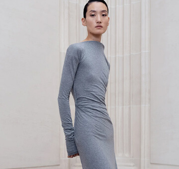
Well in fact, the American Pantone Color Chart has revealed not one, but two hues: the Illuminating yellow and the timeless Ultimate Gray. And these colours will set the tone of the year, which should be bright and full of hope! Lemon, sunflower, golden or saffron, the different shades of yellow will instantly brighten up your daily outfits. Both modern and elegant, grey hues are perfect for business looks. As the executive director of the Pantone Institute Leatrice Eiseman says: "the union of an enduring Ultimate Gray with the vibrant yellow Illuminating expresses a message of positivity supported by fortitude". At the office, give a vivid twist to your favourite formal wear with a pair of lemon yellow sandals from By Far. This summer, go for a stunning Zimmermann dress featuring eye-catching golden accents!
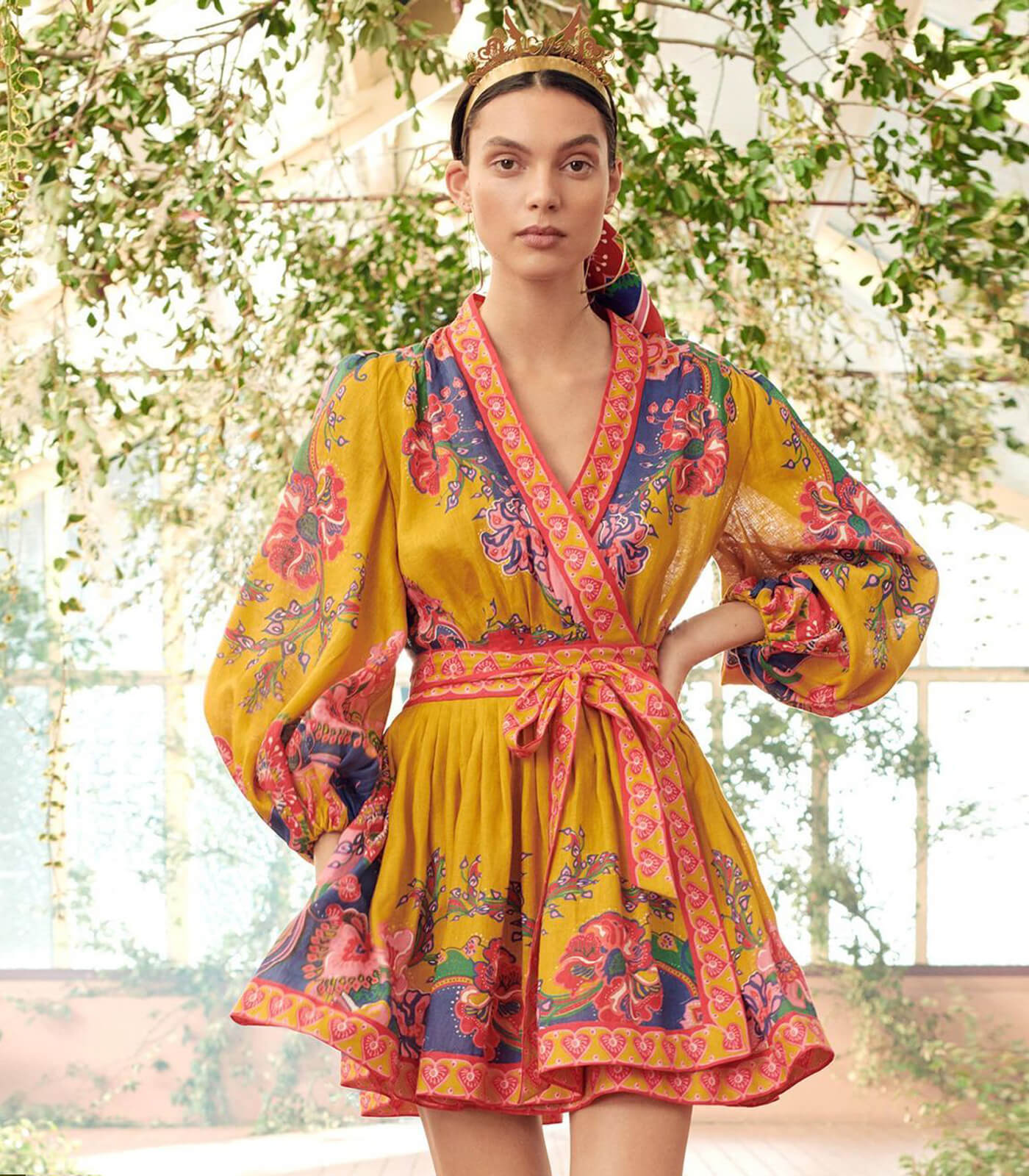
Vibrant colours, positive energies
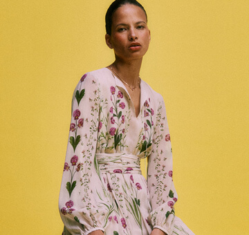
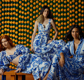
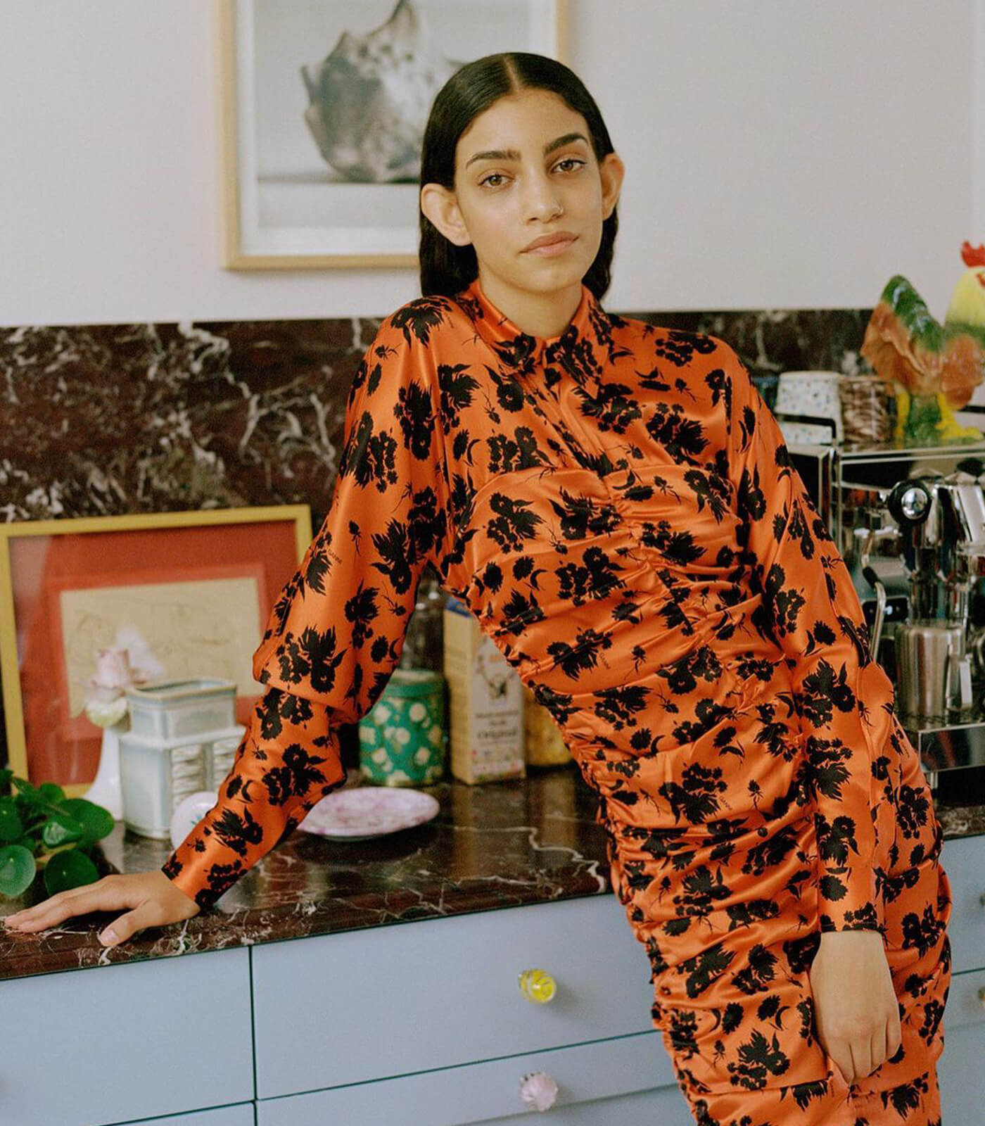
The past year has undoubtedly changed the face of fashion, but it has also inspired many designers! This season more than ever, the brands have created engaged collections using a dreamy colour palette, from pink to mauve through vegetal and almond greens. Here too, the keywords are positivity and hope, as reflected for example in the Spring/Summer 2021 collection by Stella McCartney. Through the #StellaAtoZ manifesto which reflects the values cherished by the brand and artworks by global artists, the creations all seem to be on a hunt for humour, joy and a more sustainable world. As Ganni, presents already cult key silhouettes and warm orange hues that calls for creativity, La Double J., a new brand at Bongénie Grieder seduces with super-feminine floral cuts and hues.
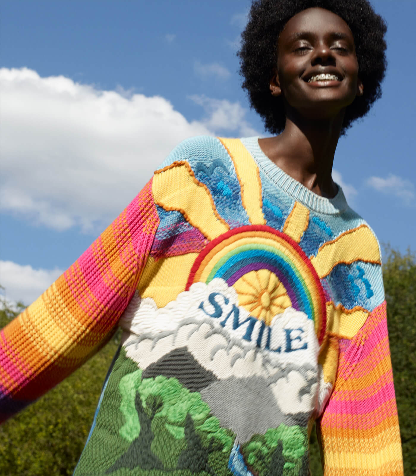
Credit: ©Stella McCartney, Kind jumper, Spring/Summer 2021 ready-to-wear collection.
Colours speak louder than words
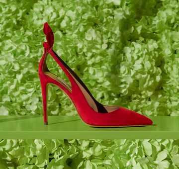
If the designers are playing with the colours’ significations in their collections, one should now experiment and have fun mixing different hues together. But how? Finding the right colour combination sometimes can be a true balancing act. However, this few golden rules should help you get confident about adding (pops of) colours to your wardrobe. If you are taking your first steps in this exercise, limit yourself to two (or three colours) first, with only one dominant hue. This will guarantee a harmonious visual effect and also avoid falling into chromatic excesses that can hurt your eyes. Also think to combine complementary hues, such as yellow and purple, orange and blue, red and green… The brighter colour will instantly catch the eye. The most adventurous of you can also rock it by mastering the subtle art of camaïeu, which consists of creating a sophisticated gradation of different hues of the same colour. That all being said, if the rules are meant to be „learnt like a pro, so you can break them like an artist“, as Picasso said, there are indeed no strict rules. Only more risky options than others…The choice is yours!
Credit: © Ganni, Flower dress, Spring/Summer 2021 ready-to-wear collection.
28/01/2021